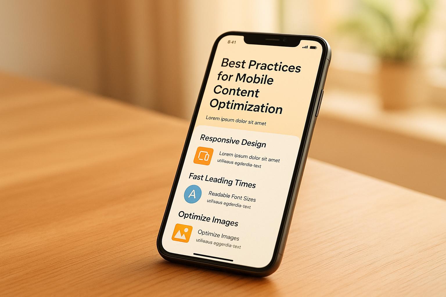
Want your site to perform better on mobile? Here’s the deal: optimizing for mobile is no longer optional – it’s a must. With mobile traffic dominating the web and Google’s mobile-first indexing, businesses need to adapt fast. Here’s what you need to know:
- Focus on User Experience: Make content easy to read, navigate, and interact with on small screens.
- Speed is Key: Pages should load in under 2.5 seconds. Compress images, streamline code, and use tools like CDNs.
- Responsive Design: Ensure layouts adjust seamlessly to different screen sizes.
- Local SEO Matters: Use location-specific content and optimize for ‘near me’ searches.
- Track Performance: Monitor metrics like bounce rate, scroll depth, and Core Web Vitals to improve continuously.
Quick Overview:
| Focus Area | Key Practices | Why It Matters |
|---|---|---|
| Content Design | Clear structure, readable text, responsive layouts | Boosts user engagement |
| Technical Performance | Fast load times, optimized media, Core Web Vitals | Reduces bounce rates, improves conversions |
| Local SEO | Location pages, local keywords, schema markup | Improves local search visibility |
| Analytics | Track user behavior, use predictive insights | Enables smarter, data-driven decisions |
Start with these steps to make your mobile content shine. Want more details? Keep reading!
Boost Your Website’s Mobile SEO: Top Strategies for 2024 #mobileseo #seo #mobileoptimization
Mobile Content Design
Creating a great mobile experience isn’t just about technical tweaks – it’s about designing content that connects with users. A well-thought-out mobile content strategy organizes information in a way that feels natural and engaging, no matter the device.
Clear Content Structure
Keep mobile content simple and easy to follow. Use clear headings and plenty of white space to make your layout clean and user-friendly. Break information into short, logical sections so users can quickly grasp your key points without feeling overloaded.
Improving Readability
Make your content easy to read and scan. Stick to clean typography and straightforward layouts that guide users through the page effortlessly. This approach not only makes the content more engaging but also ensures it’s accessible to a wide audience.
Adjusting for Different Screen Sizes
Design with flexibility in mind. Your layout should adapt to various screen sizes, ensuring the most important information is always front and center. Responsive design principles help maintain a consistent experience across devices, improving navigation and keeping users engaged. These choices also play a role in boosting your site’s technical performance.
Technical Performance
A fast, responsive website improves mobile user engagement and increases conversion rates.
Speed and Web Vitals
Core Web Vitals are key metrics for measuring mobile performance. Aim for these benchmarks:
- LCP (Largest Contentful Paint): Under 2.5 seconds
- FID (First Input Delay): Under 100 milliseconds
- CLS (Cumulative Layout Shift): Less than 0.1
To achieve these targets, optimize server caching, streamline JavaScript and CSS delivery, and consider using CDNs to serve content from edge locations for faster load times.
Mobile Media Files
Keep file sizes small while maintaining quality. Here’s how to do it:
- Use the right image format
WebP offers better compression than JPEG or PNG. To ensure compatibility across all browsers, set up a fallback system:<picture> <source srcset="image.webp" type="image/webp"> <img src="image.jpg" alt="Description"> </picture> - Enable scalable image sources
Use thesrcsetattribute to serve images based on the user’s screen size:<img src="small.jpg" srcset="small.jpg 300w, medium.jpg 600w, large.jpg 900w" sizes="(max-width: 320px) 280px, (max-width: 640px) 580px, 800px" alt="Description">
Easy Mobile Navigation
Make navigation simple and accessible for users operating their devices with one hand. Key tips include:
- Touch-friendly design: Buttons and interactive elements should be at least 44×44 pixels.
- Menu placement: Position essential navigation elements within thumb reach for ease of use.
- Clear visual hierarchy: Use visual indicators to help users understand where they are and what actions they can take.
For more complex menus, hamburger icons work well, but always keep critical navigation paths easily visible. Additionally, include a persistent search icon in the header for quick access to key content.
These technical improvements lay the groundwork for better local mobile SEO strategies.
sbb-itb-3726a71
Local Mobile SEO
Local mobile SEO focuses on making your business visible to nearby users searching on their mobile devices. Below, we break down strategies for creating location-specific content and optimizing for ‘near me’ searches.
Local Content Creation
Crafting location-based content means addressing the needs of local users while ensuring it works well on mobile devices. Here’s how:
Using Schema Markup
Adding schema markup helps search engines better understand your business details. Below is an example of schema code for a local business:
<script type="application/ld+json"> { "@context": "https://schema.org", "@type": "LocalBusiness", "name": "Business Name", "address": { "@type": "PostalAddress", "streetAddress": "123 Main St", "addressLocality": "City", "addressRegion": "State", "postalCode": "12345" }, "geo": { "@type": "GeoCoordinates", "latitude": "40.7128", "longitude": "-74.0060" } } </script> Tips for Local Content Optimization:
- Location Pages: Build individual pages for each service area, focusing on details unique to that location.
- Local Keywords: Naturally weave city, neighborhood, and regional terms into your content.
- Mobile-Friendly Layout: Use clear headings and short paragraphs to ensure a smooth experience for mobile users.
‘Near Me’ Search Results
Optimizing for ‘near me’ searches requires fine-tuning your location signals. Here’s a quick guide:
| Location Signal | How to Implement | Impact on Rankings |
|---|---|---|
| GPS Coordinates | Add Schema Markup | High |
| Business Address | Ensure NAP Consistency | Critical |
| Service Areas | Highlight on Location Pages | Medium |
| Local Keywords | Integrate into Content | High |
Mobile Analytics
Mobile analytics provide insights into user behavior, helping you fine-tune your content strategy for better performance. These insights work hand-in-hand with technical and local SEO efforts to ensure a smooth experience for mobile users.
Mobile User Tracking
Key metrics can help you monitor how users interact with your mobile content:
| Metric | What to Track | Why It Matters |
|---|---|---|
| Bounce Rate | % of single-page visits | Highlights if your content is relevant |
| Time on Page | Average session duration | Measures how engaging your content is |
| Scroll Depth | How far users scroll | Shows how much of your content they view |
| Exit Points | Where users leave | Pinpoints areas that may need improvement |
| Load Time | Page speed on mobile | Directly impacts the user experience |
To dig deeper, tools like heatmaps can provide visual insights:
- Tap Analysis: See where users tap most often to improve button placement and calls-to-action.
- Scroll Maps: Identify where users stop scrolling, revealing content areas that may need adjustment.
- Session Recordings: Watch real user interactions to uncover navigation issues or pain points.
thezechners Propensity Engine
The thezechners Propensity Engine uses predictive analytics to anticipate user behavior, helping businesses refine their content and conversion strategies. This tool provides actionable insights to improve user engagement and drive results.
Real-Time Attribution Benefits:
- Pinpoint high-performing content based on user engagement trends.
- Optimize spending on paid media with data-backed decisions.
- Adjust content layouts and structures based on predicted user actions.
Conclusion
This section breaks down key strategies into actionable steps to help you achieve success in mobile optimization.
Main Points Summary
Optimizing for mobile is now a critical part of digital strategy. Here’s a quick overview of the key areas to focus on:
| Focus Area | Key Practices | Impact |
|---|---|---|
| Content Design | Clear structure, readable text, responsive layouts | Boosts user engagement |
| Technical Performance | Optimized site speed and functionality | Reduces bounce rates, improves conversions |
| Local SEO | Location-specific content, "Near Me" keywords | Improves local search visibility |
| Analytics | Track user behavior and leverage insights | Enables smarter, data-driven decisions |
Implementation Guide
Here’s how you can turn these strategies into action:
- Technical Foundation
Start with a technical audit to enhance Core Web Vitals and improve site speed. This creates a strong base for mobile optimization. - Content Adjustments
Follow these practical steps to align with best practices in content design and performance:- Break text into easy-to-scan sections.
- Use responsive images that adapt to different screen sizes.
- Ensure navigation is touch-friendly.
- Write concise and impactful headlines.
- Analytics Integration
Utilize analytics tools, such as thezechners Propensity Engine, to:- Monitor user engagement trends.
- Identify your top-performing content.
- Apply predictive insights to anticipate user needs.
- Measure the effectiveness of your mobile efforts.
Mobile optimization isn’t a one-and-done task – it requires ongoing updates and monitoring. Use tools like thezechners Propensity Engine to refine your strategy continuously, based on real performance data and user behavior.
FAQs
How can I optimize my mobile website to load quickly while still including rich media content?
To ensure your mobile website loads quickly while incorporating rich media, focus on efficient media optimization and smart design practices. Compress images and videos without compromising quality, use modern formats like WebP for images, and implement lazy loading to defer loading media until it’s needed. Additionally, minimize the use of heavy scripts and prioritize mobile-first design to streamline performance.
Adopting a content delivery network (CDN) can also significantly improve load times by delivering content from servers closer to your users. Regularly test your site’s performance on tools like Google PageSpeed Insights to identify areas for improvement and maintain an optimal user experience.
How can I optimize my website for ‘near me’ searches to boost local visibility?
To optimize your website for ‘near me’ searches and improve local visibility, focus on these key strategies:
- Claim and optimize your Google Business Profile: Ensure your business details are accurate, including name, address, phone number, and operating hours.
- Use location-specific keywords: Incorporate terms like ‘near me’ and your city or neighborhood into your website’s content, meta tags, and headings.
- Encourage customer reviews: Positive reviews on platforms like Google can improve your local search rankings and build trust with potential customers.
- Ensure mobile-friendliness: A mobile-optimized website is crucial, as most ‘near me’ searches occur on mobile devices.
By implementing these practices, you can increase your chances of appearing in local search results and attract more nearby customers to your business.
How can mobile analytics help improve user engagement and refine content strategies?
Mobile analytics can provide valuable insights into user behavior, helping you understand how your audience interacts with your content on mobile devices. By analyzing metrics like session duration, bounce rates, and click-through rates, you can identify what resonates with users and areas that need improvement.
To refine your content strategy, focus on trends such as the most popular pages, user demographics, and device preferences. These insights allow you to tailor your content to meet user expectations, improve engagement, and boost overall performance. Regularly monitoring these metrics ensures your mobile content remains optimized and aligned with user needs.